De Boekenzoeker
March 2023
The challenge
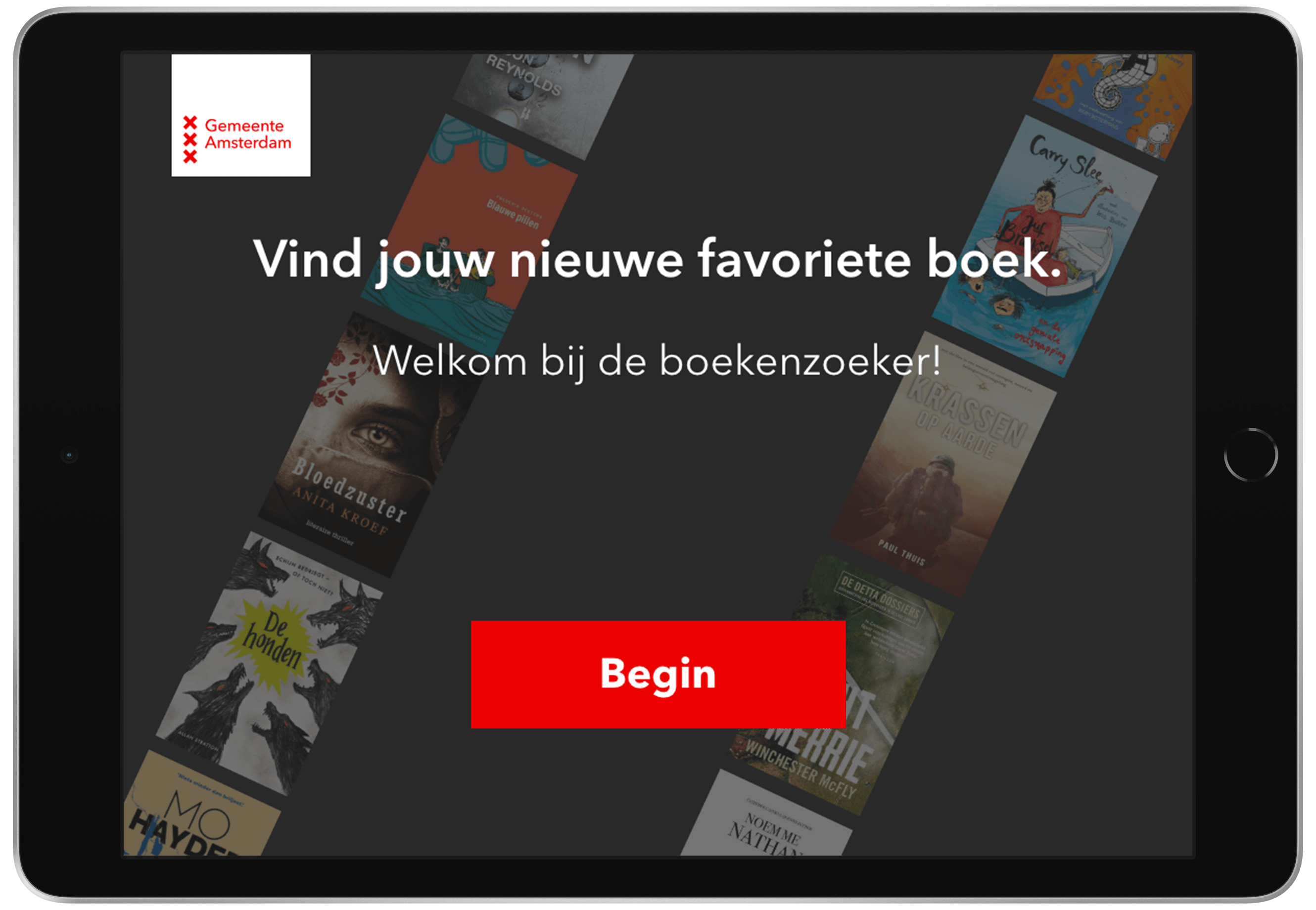
This design challenge was to create a user interface for a public iPad on a stand in a library that lets users find their favourite books. For this UI, I had to develop a substyle based on the visual identity of Gemeente Amsterdam.
The layout
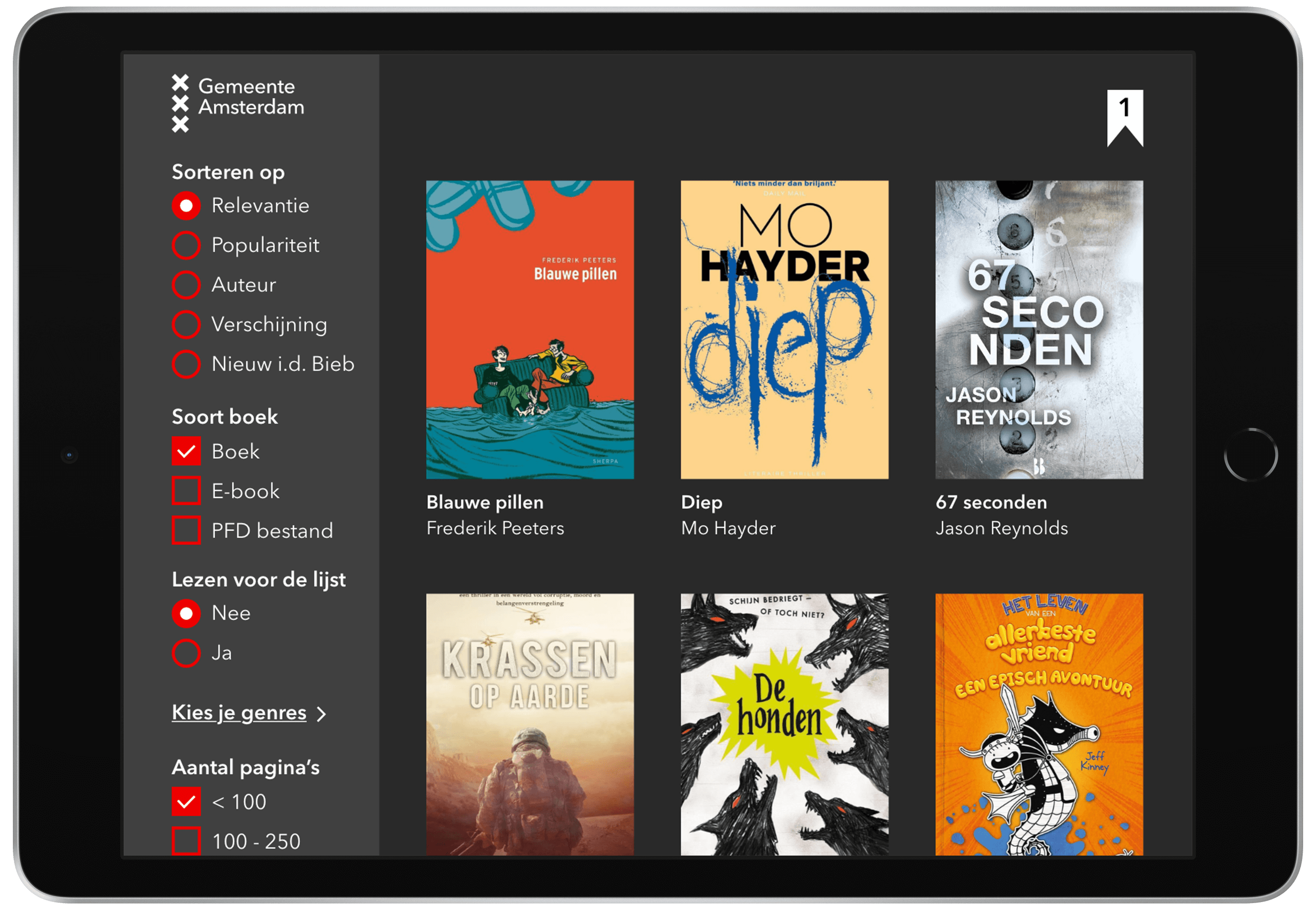
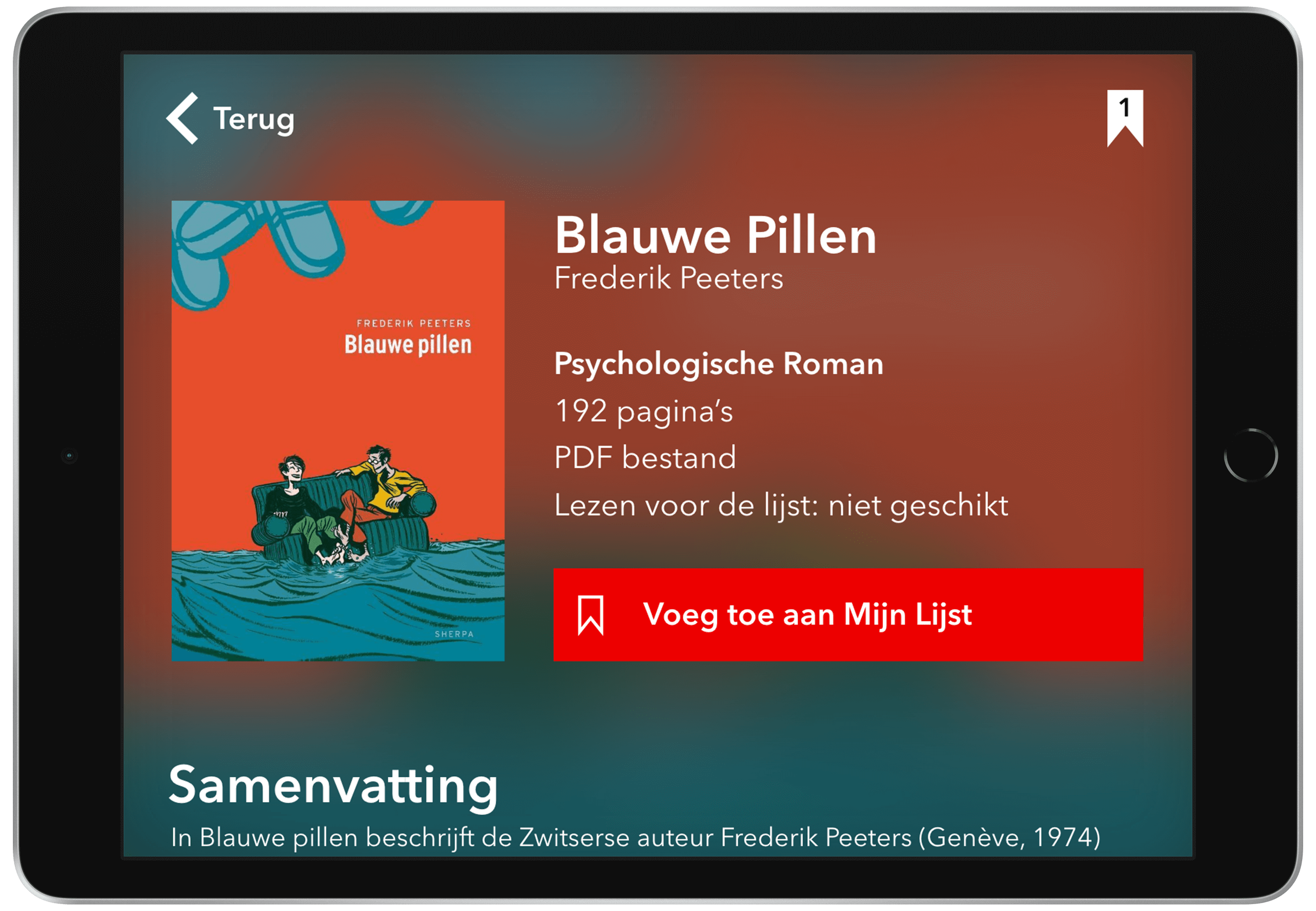
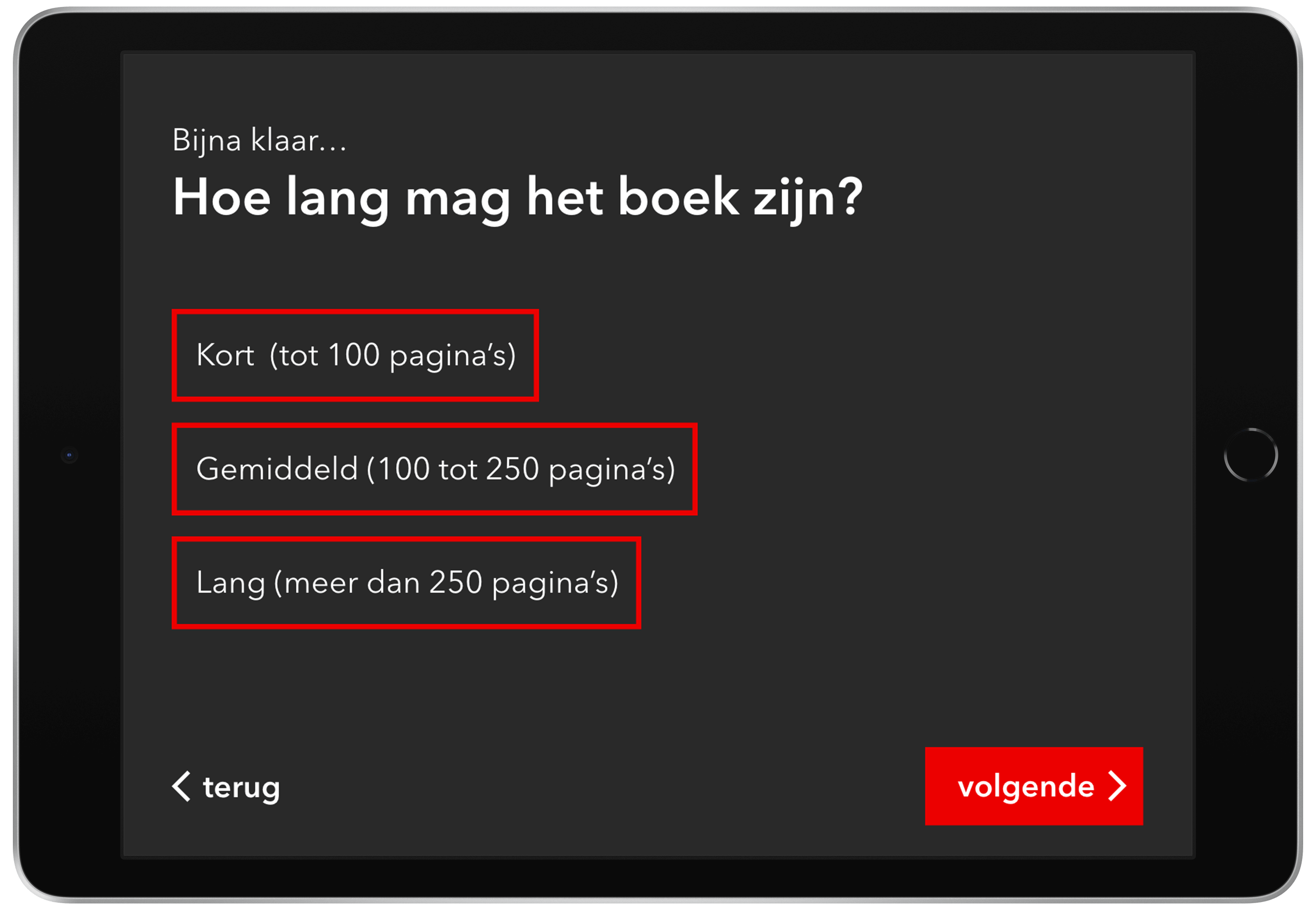
It was very important to keep in mind that this design will be used in a public and busy space. Because of this, I made the text and buttons larger, so it's easier to use. I also made sure that the pages weren't too full with content so the user can scan them easily.
The design
For the design, I chose to use the classic red shade used by Gemeente Amsterdam as my primary colour. I also used the same font thats used on the website. I chose a dark theme for a calm ambience that matches with the quietness of the library.
The result
During this project, I learned to incorporate a visual identity and develop a new sub-style from that identity. This project also required me to really keep the context factors like device and environment in mind in order to create a functioning design. In the end, I put all these skills together to create an intuitive user interface that perfectly fits the visual identity of de Gemeente Amsterdam.